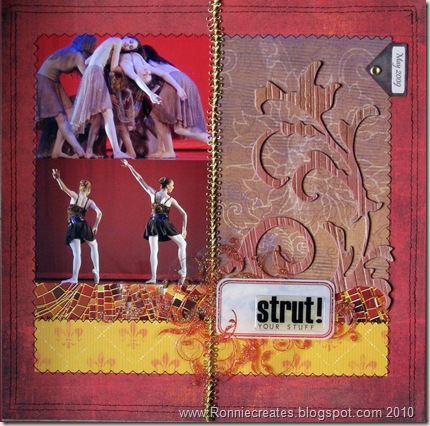
To show how versatile sketches are I decided to make another layout on the same sketch I did for the last post. I turned the sketch by 45 degrees so I could include landscape pictures.

Added a grunge board swirl which I colored with glimmer mist to give some dimension to the right side of the layout as I didn’t have any journaling I wanted to add. With this sketch you could include a 7 by 5 picture in addition of the large area of patterned paper as well. That would give even more options!
And just for fun another quick digital layout I did for camp scrap yesterday – digital template was provided by Allie Edwards and papers etc came from a freebie at designer digital by Katie Pertiet


No comments:
Post a Comment