Friday, July 23, 2010

Photoshop Friday Series

At JessicaSprague.com there is a series of photoshop short tutorials called Photoshop Friday. So far I’ve bought two of these when they have been on special so they have cost me a $1 – yes that is not a typo. Now they are short and sweet but they come with a mini-kit and template to make the layout as part of the class so for a dollar they are a sweet deal. I’ve learned that like at Kohl's when shopping for digital supplies you only buy when things are on sale. Most of the digital websites have at least one day a week when things are on special and you just need to sign-up for their newsletter to know when.
Anyway yesterday I took Philip and his friend to the pool for some fun in the water at LMRA and when I opened the latest tutorial I had purchased to work through I realised the pictures were perfect for the layout. I was very proud of myself as I also actually did some photo editing before I made the layout to make the water bluer and put some ‘extra’ water behind philip. The highlights also needed some work!

Before

IMG_4735

After
 fixed

How cool is that! The reason I added the extra water behind him was so the picture would fit better in the template. In the end I didn’t need it that much as I realised I could just angle the picture – durrrr…….
Here’s the final layout. What I learned to do was using the text on curve tool – now in photoshop elements you have to use a text path purchased from someone else but I’m lucky if I want to do this Anthony has an earlier version of the full photoshop I can make the curves in. That will be for another day – for the moment I’m happy with what I did and what I’ve learned. Creating my own curves is for another day.

LMRA_Pool (Large) (2)
 

All supplies from JessicaSprague.com – Photoshop Friday Series No.10

Thursday, July 22, 2010

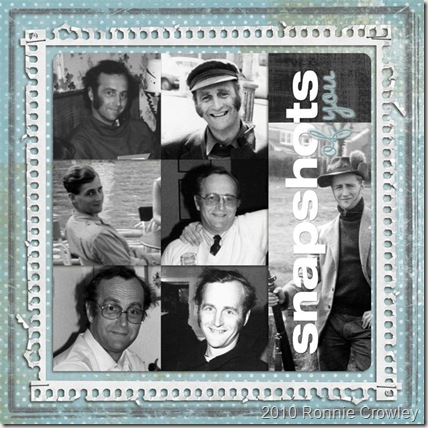
Snapshots of you - Dad

In January 2007 my Dad had a massive stroke and since them has spent his time confined to a wheel chair watching the world go by. I haven’t seen him since the last trip we made to England but I prepare myself for another step backwards in terms of what communication there is. Last time I visited he certainly recognised me but this time I’m not so sure it will happen from what my sisters report! Thanks to my mother-in-law I get to speak to him about once a month as she calls on her cell phone from the nursing home. I don’t know what he makes of this but I tell him I love him and we miss him and I pray that he at least understands the words.

I have been struggling with what to take with me for my next visit. The last few times I’ve taken T-shirts but really how many does he need. I send DVD’s for him and his visitors to watch for his Birthday and Christmas. So I wanted to do something different. If you’ve been reading my blog for a while you’ll know I’ve started playing with digital scrapbooking so I decided to make a layout for him which I will put in a frame for his wall. The pictures are all of him over the years. Some of my favorites from the pictures my sister Juliet got scanned by a company so we could have digital copied of them.

Dad (Large)

Supplies – Template No 19 Cathy Z, Notebook Edge Frames and KPertiet_Edges all from designerdigitals.com; Carina Gardner Distressed Urban from designhousedigital.com and jbarrette_shadowstyles from scrapmatters.com

Tuesday, July 20, 2010

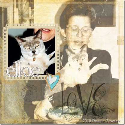
Blending Layers in Photoshop Elements

So today I decided I wanted to learn something new about photoshop elements and create a new digital layout. I had purchased the “How’d they do that?” – course called the perfect blend from ww.designerdigitals.com it was well worth the money. It comes with a digital paper, a digital brush and all printable step-by-step instructions. The only negative is that I’m using elements 8.0 and I don’t think its been updated for the changes so something’s were in a slightly different place than the instructions but it was easy enough to find them and continue to work. Once I had worked through the instructions I decided the best way to make sure I understood what I had learned was to try on my own to create a layout. This is the result.

Cat_women (Large)

Supplies –
KPertiet_EdgesPREV KPertiet_NotebookEdgeFramesNo3PREV ssd-memories-preview plus the Portauprince set I purchased for Haiti from Songbird Avenue.com

Thursday, July 15, 2010

Then & Now or should it be Now & Then

May Flaum challenged us to do a layout comparing two different times and  as I was searching through the pictures to find an old picture of Eleanor with her sheep I came across a picture of Anthony and I at his 21st birthday party. Yes we’ve been together that long – well even longer we got together just before his 16th birthday…………and we’re now 42! I suddenly changed track on what my layout was going to be about as I knew I had the picture Eleanor took the night we went out for his 42 birthday that I hadn’t scrapped booked and all sheep were forgotten. When I looked at the picture from September I realized that the new basic grey kit I got yesterday was perfect for the dress I was wearing in 2009 but not in 1988. A scan  later and a conversion to black and white and I could now work with the pictures in one layout!
Here’s the original picture – that dress was so 80’s. And look at the color of hubbies hair.

21st_birthday
Copy of 21st_birthday

I also cropped the picture to get rid of some of the background as well. Love being able to scan pictures so easily. I use my HP Deskjet F340 All-in-One. It does a great job and is so easy to use.

Here’s the final layout. The kids love it!
IMG_4694 (Large)

All the supplies are Basic Grey other than the flower (handmade by me), The Thickers letter stickers and the rub-on dates. Layout is based on one by Nic Howard from the dimensional details class I was taking previously! The small picture is mounted on chipboard and for both pictures I sanded the edges to give the white edge to them.

Wednesday, July 14, 2010

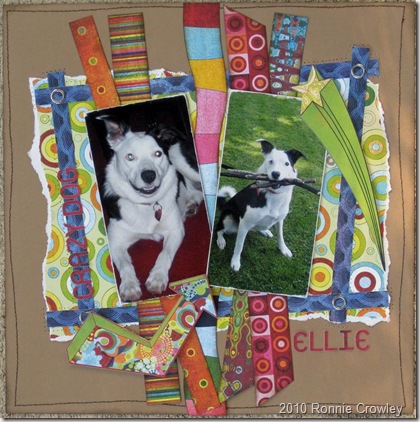
Crazy Dog – Crazy Paper

Some scrapbooking papers are just crazy colors and designs and I don’t know why I ever purchased the Lime Rickey kit from basic grey in the first place. The paper is just not ‘me’ normally but that being said I think I’ve made some of the best layouts I’ve done in a while in the last month or so using this kit. The latest I completed last night and can I just say I’m really happy with the outcome. Its based on sketch #112 from creative scrappers.
IMG_4693 (Large) 

If you look closely at the layout you can see I did stitches around the “frame”. I did this my sewing machine with no thread in it. Doesn’t show very well in the picture but adds some dimension in real life. The pictures are also mounted on chipboard to raise them off the page and then the edges sanded. The Star and arrow are foam taped also to raise them.

Just got in the mail another kit from basic grey so look out for a change of paper soon – here’s hoping it makes me create layouts of a similar standard (in my opinion and that’s whose opinion matters as my pages are the one thing I’m 100% in control of so if I’m happy all is good!).

Sunday, July 11, 2010

Technique rich layouts

Once in a while I feel like creating a page which is more in depth in terms of the techniques I use on it or the mediums I use. Last night I decided I wanted to play with my paints and glimmer mist. (One of the reasons I could never go totally digital is my love of getting messy sometimes when I’m scrapping – digital just isn’t so much fun!). So I decided I would make my own background paper. Originally I was doing it for a different set of pictures but I was moving things around on my desk and managed to knock a pile off and when I was sorting the stuff out I found an envelope of pictures from our trip in 2008 which I had never scrapped. I was flipping through them and this one spoke to me and I realized I wanted to do an ‘artzy’ page with it. Not really recording a memory which is 99% of my scrapbooking but using the image to remind me to dream about possibilities. Doing a layout like this also means I have more freedom to play with the messy stuff! Here’s what I created.

IMG_4691 (Large) (2)

The background cardstock started life as a piece of CTMH textured white cardstock. I took two masks and using tattered angels glimmer mist in tattered leather color I sprayed the paper. Once it was dry I then took some new CTMH stamps called Live inspired and used the corner stamp in this set with Tim Holtz distress ink to stamp around the edge at all different angels. The picture is then matted in twilight paper by CTMH – the lighter color is the reverse side of the twilight textured cardstock. The “dream” was a piece of pre-cut chipboard i picked up at Michaels – I sprayed with a blue glimmer mist and a copper one. The saying “Live inspired, dream with possibility” was a saying on the stamp set and I stamped it first off but it was too small so I recreated it in word and printed on an overhead. The compass, arrow and other words are CTMH rub-ons.

When finally complete I’m really happy with the look I created. May even get a frame for this one and put it on the wall rather than hiding it away in a scrapbook album. For those interested this picture is of Ecole Beach in Oregon. It was a grey and dismal day but Anthony still managed to get this picture.

Today I also made a quick digital page using the challenge template on designerdigitals.com. I used digital brushes to create my own digital background paper in a similar way with the traditional layout. Fun to see how you can recreate techniques digitally. Other supplies are :-

Winged Words Brushes and Stamps - Katie Pertiet
LivEdesigns - Afternoon Stroll
SBA-portauprince

butterflies (Large)

Friday, July 9, 2010

Another take on the same sketch


To show how versatile sketches are I decided to make another layout on the same sketch I did for the last post. I turned the sketch by 45 degrees so I could include landscape pictures.

IMG_4687 (Large) 

Added a grunge board swirl which I colored with glimmer mist to give some dimension to the right side of the layout as I didn’t have any journaling I wanted to add. With this sketch you could include a 7 by 5 picture in addition of the large area of patterned paper as well. That would give even more options!

And just for fun another quick digital layout I did for camp scrap yesterday – digital template was provided by Allie Edwards and papers etc came from a freebie at designer digital by Katie Pertiet

good_times (Large)

Wednesday, July 7, 2010

Fast and Easy Layout

Yesterday I didn’t get to scrapbook so today I’m trying to catch-up yesterdays layout and do today’s – plus work, keep house and all the other things that go along with having 2 kids home for summer. Add the hubbie coming home to watch Germany via Spain, so I couldn’t scrap like planned this afternoon!

For Camp scrap yesterday May Flaum provided a great sketch from Valerie Salmon, a name I didn’t know but I’ve now added her sketch blog to my Google reader so I won’t miss any of her future sketches that she shares. First I will share my version of the sketch – this time it really is a straight take on the sketch. That’s the great thing about sketches sometimes you can do that just as they are, other times you can change it out to fit your pictures. This time as I was short on time I decided it would work for me just as it was! Taking about changing sketches out I recently bought a book on changing out sketches from Ella publishing. They sell some great e-books which you can download and print at home or read them on your computer. The following article is a great article about the book and using sketches – check it out by clicking here.

IMG_4679 (Large)


Monday, July 5, 2010

Sketch #111 – Creative Scrappers

Have to repeat how I love working with sketch’s and creating my own version. I’m also really enjoying using trims on my layouts at the moment. Yesterday Sketch #111 from Creative Scrappers arrived in my google reader and I knew I just had to play along but what with cleaning the house (yes I sometimes have to stop scrapbooking and attend to the daily chores) and having invited the neighbors to our “English” 4th July Celebration grill I didn’t have time to play yesterday. This is the first day in a while I haven’t created a layout, I really have been working on trying to allocate some creative time each day and missed it yesterday. I mean cleaning just isn’t as satisfying, especially with children in the house who seem to create a mess as fast as you clean it up!

Here’s my take on the sketch
IMG_4675 (Large)

The papers are all CTMH, rub on swirls Heidi Swap, Memories tag and butteflies CTMH, round letters misc old product (sorry had these about 5 years and no clue who made them). Trims I got from the local (or no so local scrapbook store). I used my i-rock tool again to add bling to the trim and butterflies – can I say how much I love that tool. Really make it easy to add bling  - well that is if you don’t tip the container over when its open!!!

Really happy with how it all came together in the end – note I even hand wrote my journaling. I hate to write on layouts as I don’t have fancy handwriting and always worry I’m going to make a mess but sometimes I make myself do it and today was one of those!

Saturday, July 3, 2010

Fun layout for Saturday morning…..

Started the morning moving some pictures off my point and shoot and re-cataloging them so they were stored ready to print. I try and do this on a regular basis just incase the card gets corrupt or something. I know so many people who have lost pictures with lost cameras or corrupt card. So if you have done it recently get it done this holiday weekend!

Once I was had finished the family were still sleeping so I decided to play with PSE 8 again and try another layout. I recently had downloaded a free template from www.designerdigitals.com for a template challenge – the template was by Pattie Knox and had space for lots of pictures. Having just sorted my “snaps” I knew I had lots of guinea pig pictures and it would be a fun template to use with these.The kit I used with the template was LivEdesigns_AfternoonStroll-PPack from www.jessicasprague.com.

slash (Large)

I don’t very often scrapbook using my pictures who would when they have a semi-professional husband. My pictures can’t compete with his but I’m still really happy with the results. I couldn’t get PSE8 to remove the guinea pig red eye. I’m guessing guinea pig eyes are different and I maybe need a different tool. I now have to create a second page for Galaxy our other guinea pig – I think I’ll try and flip the template so I have mirror image layout to go in the album.

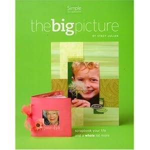
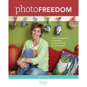
Talking about albums – I gave up on chronological scrapbooking several years ago after reading the Stacey Julian book. Now I have themed albums. So Eleanor has a dance album and Philip a sports album. We have trip albums, everyday Eleanor and everyday Philip albums (these include school layouts) – then my favorite album is our special people album and this is where these layouts will go. Joining the page on Boris the hamster. If your still chronologically scrapbooking I highly recommend moving away from this – the freedom it has given me is great. I can just scrapbook what  I feel like – like this morning. The pictures of Slash just appealed to me at 9am on a Saturday morning. If I was a chronological scrapbook I’d have to wait until I got to that point.

Here are links to the two books by Stacey Julian which got me to change, highly recommend them both although I can’t believe how much copies are going for as they are out of print! If your in Fort Worth and want to read them you can contact me and loan them if your promise to return!

Friday, July 2, 2010

Part 2 – dimensional details

So I’ve decided to work my way through the dimensional details class again myself – why you may ask. Well I really think I need to go through all the material again so I make sure the things I’ve learned to do are now naturally part of my layouts and also to keep me scrapbooking. While I do this I also need to keep-up with the camp scrap challenges and stuff so where I can I will combine the two to create my layouts.

Yesterday at Camp Scrap it was “Artistic Thursday” and the idea to add into a layout was paint splatter. I have to say this was a little out there for me. I like to be in control of what happens on my layout and your not in control of paint splatter (my face and clothes are evidence of that) but part of doing these classes is trying different ideas out so splatter it was! Splatter on a heritage page as well – didn’t take the easy way out and do a page of the kids painting or something like that.

IMG_4590 (Large)


The papers are from a set of papers I got from Costco a while back – not sure who made them but I bought them with the view to use them for heritage pages and they put them away and forgot about them. Came across the other day and thought I need to get using them – I mean there is only about 500 pieces of paper to be used. If you look at the cluster there is a tulip swirl – got this from Australia from one of the students, Rae,  in Dimensional Details class who has her own store www.scrapmatrix.com she offered us all a discount so I had to order some things. They arrived yesterday and I just use one of my new things on a layout. They are made of a very light product like chipboard which can be painted or colored in similar ways to chipboard. I used glimmer mist to color it this time and was very happy with the way the color set. Highly recommend these unique items especially for your heritage pages. The shipping wasn’t too bad from Australia and it took a little over a week to arrive which is no longer than some place in the USA.

The other thing I thought I’d share was the page I made at the start of dimensional details 13 weeks ago to show you how two very different pages can be made using the same instructions.

IMG_4129 (Large)

Thursday, July 1, 2010

Simple Pleasure and the be-dazzler for scrapbooks.

Until you loose your health I don’t think we total realise what we have. Yesterday for camp scrap we had to create a layout about the everyday and the hear and now. Got me to thinking as I was looking at the pictures that I have printed ready to scrapbook about my Dads hear and now.

On January 7th 2007 my Dad had a major stroke. He had been living alone since my Mum died but was active and involved in the local community. Since the stroke he has been living in a nursing home with 24 hour care. The hear and now for Dad is what you would expect in a nursing home and the limitation there are of that. The home is great and my sisters visit as regularly as they can. Myself being on the other side of the world finds it harder but my in-laws visit about once a week for me. When I do visit I try to take him to the local pub as often as the weather allows as this is one thing I’m 100% sure brings him pleasure. He is now a man of few words but that pint is nectar from heaven as far as he is concerned and if I can bring him joy but taking him for one I will. So the pictures I scrapped are taken on one of those walks to the pub – recording that simple pleasure of a pint of beer, a good newspaper on a summers day in England.

IMG_4587 (Large)


All the papers used other than the base page were from my scrap supply! To make the title I cut the word PLEASURE using my gazelle and sponged the edges. I then adhered to the cardstock prior to sewing with my machine several lines of stitches. Then added the word simple in alpha foam stickers on the top. The coppery swirls in the cluster I made myself using my tool I-ROCK

Can I just say I love this new tool – the be-dazzler for scrapbooking. So easy to use and add some dazzle in your layouts. See the movie below for a short intro to the tool. Let me say I will be ordering myself some more bling to use with this tool – I only ordered limited colors. The tool itself costs less than $10 and the cheapest place I found to buy it was www.scrapbooking-warehouse.com but that may not be true still or you maybe able to find it somewhere you can use a coupon!