Tuesday, June 29, 2010

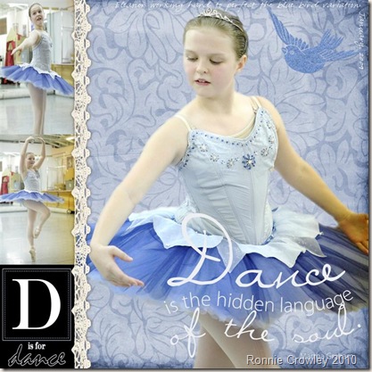
Blue Bird - My first digital layout without a template

Well Eleanor has gone off to see the new movie Eclipse, without me at the last minute so I’m trying to prop my eyes open till she gets home. Decided to try my hand at some more digital scrapbooking and set myself the challenge of cutting an image out of a photo and using it one a page. Its only taken me 2 hours but I’m done. The magic extractor tool in PSE 8.0 is really cool! Made it really easy to do when I worked out it was the right tool to use! I know I’ve already traditionally scrapped these layouts but I wasn’t expecting to like the resulting layout so much – don’t you like the blue bird in the corner! Wasn’t planning a second blog post today but was so excited to have done this I had to share!

Blue_bird (Large)

Technorati Tags: ,

Quote from Ballet Brushes n Stamps by Jesse Edwards
Dance Sticker - ArtWHSE_DanceRubons-n-Brushes - Danelle Johnson and DesignerDigitals.com
Lace - Copyright©2009 Digital Fingers by Louise Williams Choco Mint
Bird - porta prince set

Happiness is……

So last night when I blogged I said I was off to make another page – well this is it. This page came together in a little over an hour which I was happy with it. Its based on a sketch from Creative Scrappers Blog Sketch #110

I subscribe to this blog in my google reader and love all the sketches they do but this one especially stood out for me. If you don’t use google reader I highly recommended it for keeping up with blogs you like (mine especially!).

IMG_4581 (Large)

Most of the layout is based on the papers from Basic Grey – just the cardstock which is CTMH and the added bling is CTMH as well. The That Thing You do – is a rub-on that I’ve had for an age. Its just went so well with what I was trying to record in this layout that I think it was made for it. So in Cathy Z words – old product alert!! The layout is my record of my baby boy and how he makes me so happy when he gives me those random hugs!


Well its raining again in Texas – strange third day on the run. Warm rain but still rain which makes taking pictures of my layouts harder as I usually do it outside. Hope it dries up soon as I have to drive for an hour.

Not my favorite thing to do in the rain. Also like for a few dry days before Hurricane Alex (or what is left of it) comes through!

Monday, June 28, 2010

Another Dimensional Layout or two…..

Been hard at work over the weekend trying to keep up with the pace of class and make my layouts. I have a weeks overlap of the two classes which means two sets of homework. This weekend I finished the last two layouts for the dimensionals class. That isn’t to say they are the last last as a group of us have decided to start at the beginning of the class again from next week and see what new layouts we can come up with. Big Picture Scrapbooking has even created us another gallery in the classroom for post class layouts  - how cool is that! 

The first layout I created is another dance once. I really found these pictures hard to work with as the color of the tutu didn’t work with any blue papers I had or could find so I went for a paper which had more pinks and just a hint of blue in the background.

IMG_4574 (Large)


The flags are all the rage at the moment if you follow online scrapbook sites and magazines and we learned how to make them this week so had to add my own to the layout. I stamped in the dark purple colors on some patterned paper to bring out the color from the background patterned paper. First time I’ve stamped in a while! Each triangle was inked and then stuck in place prior to me sewing three runs of stitches across. Just above the flags is a overlay I printed at home – it ties in the border of the layout which is the outside edge of a paper I used earlier in the class and had kept. Don’t you love the dragon fly – I found him at the scrapbook shop in Waxahachie last week. Going again tomorrow so I may bring another one home. The hearts and chipboard frame I sprayed with glimmer mist and inked. In the end I wasn’t totally happy with it but given the response on the class gallery I think that’s just me!

The second layout I did this weekend for class was the result of an inspirational email that Nic sent out. As soon as I saw the email I knew I had to do this one! Love Love it – if I say so myself. The circle of brads with a string through it – brilliant idea – wish it was mine but no that was on the layout in the email and I just replicated it. Still I love it and will do that again.

 IMG_4576 (Large)

Don’t you love the look on Philips face – he was making butter from cream – lots of physical effort to do that when you just shake it in a jar!

Well I’m off to keep creating for camp scrap I have another layout I want to get started tonight. I’ll share it when its done!

Thursday, June 24, 2010

Camp isn’t only for the kids!

So I started my latest class with Big Picture Scrapbooking today – Camp Scrap – who said camp was only for the kids. This class is with May Flaum – you can check out her blog at http://mayflaum.com/ – her style is very different from Nic Howards layouts and this is the second class I’ve done with her. She has a great outlook on life and scrapbooking and this is what I especially like about her. You will find all about this if you come and join me in the class – its not too late just pop over to big picture scrapbooking website and sign-up its only $29 for a five week class, that’s a lot cheaper than my kids camps for certain and I will have something to keep when I’ve finished.

Today’s challenge at Camp Scrap was to spend sometime scrapbooking – which was easy – and I used the inspirational email which arrived in my inbox this morning as the starter for my page.IMG_4568 (Large)

Don’t often get to make pages about a dog as we don’t own one but these pictures are of Nana and Grandad's Dog “Ellie” from last summers trip to England. The DOG was made using the CTMH white chipboard letters which I colored and then painted with clear gloss paint prior to finally running through the cuttlebug to emboss with polka dots. Notice the heart – Eleanor made that for me. She has learned to crochet this summer (self taught via utube video’s) – ever since she fractured her ankle at school she’s had to find things to keep her fingers busy and this is what she’s been doing so in the end I told I needed her to make something’s I could add to my scrapbooks and this is the first of her creations for scrapbooking. May had lots of buttons on her page so I decided to follow her lead. I don’t tend to use buttons but have a large stock which I need to work on using up so this was a great opportunity for it. Initially I was concerned about the glue mess I may make doing this but then I remembered I had some glue lines (like glue dots but in a line) – this made it really easy to do. I’ve had those glue lines for ages, they seemed like a good idea when I bought them but I had to search to find them which shows me how often I’ve used them. Need to keep them out as it got me thinking about other things I could do using them. How about lines of glitter? I think it would be easy to do with the glue lines. Off to play!

Tuesday, June 22, 2010

Oh Ronnie, this is just beautiful. Love everything about it.

Imagine how happy I was to receive this comment on my layout I posted on the big picture scrapbooking class gallery for my latest layout I did this weekend. I love it when the teacher comments. I have to admit it I’m a junkie as far as checking the comments I get from other students but yesterday it made my day to check the gallery to see that Nic had taken the time to comment on my last two layouts. Sometimes scrapbooking can be a lonely hobby as you spend time creating the layout, you share it with your family – who say positive things and then you add it the album and its forgotten until you next open the album. I know I’m preserving the memories for the kids and that’s what important but deep down I admit that I’m competitive and like to know that the girl has done well! So getting a comment from Nic is just what I needed after a long hot hot day here in Texas with the two kids driving me a little crazy. Here’s the layout in question.

IMG_4547 (Large)

The funny thing about the layout is that the red heart wasn’t meant to go where it is but I had a glue whoops which forced my hand. When I placed it there though I realized it was meant to be and just drew the eye to the picture perfectly – so it was meant to be. I love the look of concentration on Eleanor’s face here and thank my lucky stars that I have a husband who takes the time to be at the studio to capture such great memories.

Sunday, June 20, 2010

Especially for Father’s Day

Using the template challenge on Designer Digitals for this week I created this digital layout about my Dad. The papers I used are from previous color challenges on designer digitals by Katie Pertiet (KPertiet_ColorChallenge61310) and I added a digital brush to give a frame around the edge which is also her’s – although this one I purchased. Can I just say I love this site for digital supplies and ideas.

KPertiet_TemplateChallenge62010_edited-1 (Large)

Friday, June 18, 2010

Just had to share this………

IMG_4543 (Large)

I’m really happy with this layout. Yellow isn’t normally a color I would choose to use but these Basic Grey Papers were left over from a kit I got and so I wanted to use them up rather than find them a home. The layout records my love of Tea – as far as I’m concerned the day doesn’t start until I’ve had my cup of tea! The photo has an overlay on top of it which is pre-printed with glitter. Its also mounted on chipboard to give some extra dimension. The flower I made from organdy fabric – cut flowers shapes out and then heated with my embossing gun. The heat makes the fabric crinkle and creates a great texture to the flower. Five of these layered up with a brad through the middle makes a great addition to any page.

Just remember working  out of our comfort zone in colors can some times create great results!

Thursday, June 17, 2010

I Love You Grandad

Another layout. Another Day. This time I used the latest sketch in Creating Keepsakes Magazine as my starting point.


I love sketches but have been using them less since I started the lastest class with Big Picture Scrapbooking as I had yet to work out how to apply what I’d learned to the sketches. I also wanted to make a layout with multiple pictures and a two page layout. So last nights challenge was to do just that. The added challenge was it was a male layout which I always find harder. I think it came out well – the embellishment clusters worked. I used a chipboard mini album I’d got on clearance. I colored it with glimmer mist and clear acrylic paint. Then I added some of those many brad etc I have stocked up on but never seem to use.

IMG_4542 (Large)

Tuesday, June 15, 2010

Handmade Flowers – Mum & Dad

Week 11 of my 13 class. If I didn’t know I was moving straight onto May Flaum’s summer camp class I’d be sad to think it was coming to an end but I know I’ll be busy the whole of July with the scrapbooking camp May is running.

I’ve made flowers and more flowers and even more flowers this week. At one point my hands were a multitude of colors from the glimmer misting and hand work involved. One important thing I’ve learnt is you can work chipboard really well when its wet to form different shapes. It dries really nicely keeping the form you created so instead of a flat flower you have one with some dimension – just spray it with some water or glimmer mist. Another thing I learnt which I’d never though of doing is running my chipboard through my cuttlebug in one of the embossing folders to give some texture. Really great way of adding interest. Why didn’t I think of that before!!

IMG_4536 (Large)
In the end I didn’t use many of my flowers on the layout assignment for the week because you ask? Well as Nic Howard said less is sometimes more and three just seemed enough and I didn’t need any color. The final layout is very similar to the one in the handout. Nic provides very precise instructions but usually mine ends up very different. Yes the papers and things I used are different but the basic design is very similar.
The frame around the picture is made using grunge board again. Its meant to have beautiful mitered corners but that didn’t work out very well for me and there were gaps so I added extra square blocks on top to hide my mistakes! Next time I think I’d paint it cream rather than the blue. I chose blue to pick out the color on the layout but I think in the end the blue of the frame sort of dominates the picture. Once done its done and I’m not changing it!
On this layout I even broke out the old foam stamps with my paint and stamped the swirls – golly haven’t done that in a while! Had to dust off the box and dig out from under the pile of other stuff – think I’ll do it again soon as it does look cool.
I should really be talking about the flowers – the large one is made of parchment paper. I punched five scalloped circles, inked the edges, put a brad through the center and crumbled each circle up individually. You then open the circles out to form the flower. Quick and simple. I’ve done this with patterned paper as well. The two smaller ones are just 3 circles of patterned paper in 3 graduating sizes, Edges inked and a brad through the center. I then wetted the layers prior to crumbling them up to soften the edges and make them easier to form into shapes. 
Check out a previous blog for some links on making flowers or go to utube and search handmade paper flowers and you will have full night of movies to watch!
Wednesday, June 9, 2010

Sketches on Blog


I love reading blog and have many set-up to my google reader so I don’t miss anything they post. There are lots to choose from out there but I love the ones which share sketches to try. Yesterday the Prima Flowers blog posted a sketch for June so I decided to play along.

IMG_4533 (Large)
Now the layout i ended up with  I don’t think I can enter for the competition part as I didn’t use prima products mainly – the ones I had didn’t work with the pictures I chose but I’m still happy with the layout and that is what matters to me with these sketches. I also got some more practice at embellishment clustering from my dimensional details class and used my new Martha punch (got to get my monies worth). It also features my three favorite colors so I was able to upload to the big picture scrapbooking student gallery for Stacey Julian’s competition for doing a layout using your three favorite colors – do you never know I may still win something yet. If you want to try and win for a layout using your three favorite colors here’s the link for that – big picture scrapbooking blog

Wednesday, June 2, 2010

Digital Layout

I will never totally move to digital layouts (well only if they stop making scrapbook supplies and given the amount of supplies I have stashed it would take a long while for me to run out) but since taking the Cathy Z class Me:The Abridged version I have been dabbling with it and asked for Photoshop Elements for Mothers Day so I could use some functionality I didn’t have in the photoshop version we had. This weekend we finally managed to get round to replacing the disk drive in the computer so we could load the software. (Its rather hard to load software when the disk drive is out of order!). I have lots to learn with digital scrapbooking and especially now I have a new program to play with and I really believe the only way to do this is to work with it and create layouts. So I thought I would do some of the recent everyday pictures I want to record.pilot_in_making_edited-1 Digital scrapbooking allows you to change your paper color to match the pictures so the two papers I used in this layout weren’t the color they are now. The cardstock was originally a lighter denim blue or indian cornblue in CTMH colors. Its from http://www.freedigitalscrapbooking.com and I messed around with the color in the blue range until I was happy with it. I say messed around as yet I’m not totally confident in how to do this and which tool does it the best. The patterned paper is from the chocmint digital kit from Louise Williams at www.digitalscrapshop.com and it was also a free download. There is so much available free on the internet in terms of digital scrapbooking supplies. I finally added the frames which I had purchased from Katie Pertiet at www.designerdigitals.com I love this store and have purchased a lot from there – but wait for a sale as they have them regularly! I was able to use the same frame for the main page and the focal picture. It was also easy to make the color of the title match the frame on the focal picture which helps pull it all together. I finally added a digital brad from the chocmint kit. Once I get it printed at Costco I may actually added a real button or something to turn it into a hybrid layout but we’ll see!
Costco print 12 inch scrapbook pages for just under $3 which when you compare to the cost of paper and embellishment isn’t bad. Its archival quality photo paper which is used. I prefer the glossy finish to the matt but that’s a personal choice.
The other fun thing I was able to do was to have the same picture in the two small picture slots but to show a different part of the original picture.
I should also note that the layout uses one of Cathy Z’s templates which is available for sale on www.designerdigitals.com I love her templates as they are so easy to use. This could be due to the fact that I’ve used them doing her big picture scrapbooking classes but I find that the way she sets them up with the layers really makes the creation of the page so easy.